|
The first two graphics below are what we think you want in Card #2.
For reference, the second two graphics are the originals (your card as of 3/11/15). Please
get back to us & tell us if we're right, or whether there are other changes to make.
|
|
|
|
|
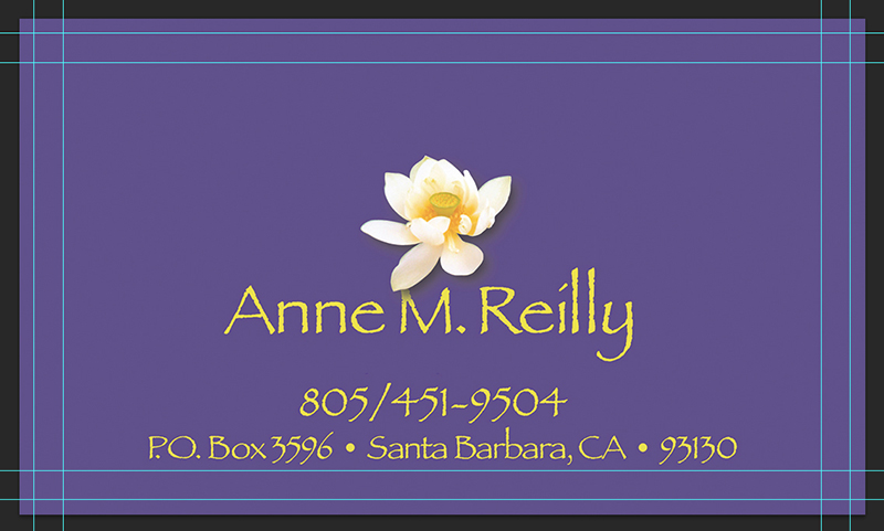
Above is the new card FRONT.
|
|
|
|
|
Above is the new card BACK.
|
|
|
|
|
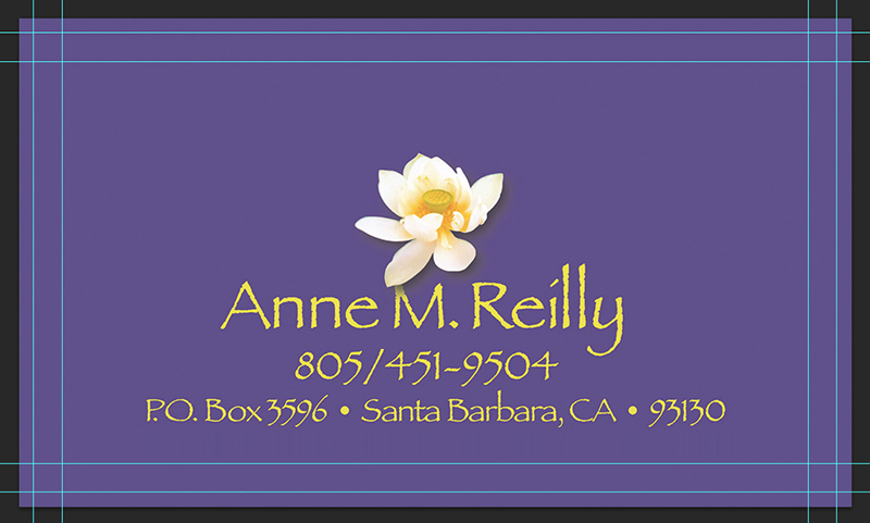
Above is the new back with modified spacing – posted Friday morning, 5/8/15.
|
|
This was a good call, Annie, to revisit this.
The power of the Lotus (at least to us) reduces the need to change its position (which is already well above the vertical center of the card), but per your suggestion to try it, we've moved the two contact lines upward to centralize the yellow graphics as more of a cohesive "block."
Two schools of thought here . . . one is that the "block" approach really does centralize the lotus
and following lines as more of a single graphic. The second recognizes that the very space (and separation) created by removing the original lines actually draws the eye to your name and lotus.
And that this separation actually makes the phone number even EASIER to pick out and read.
Remember that even in the (original) "new" back above, the address line is still well above the inner (type-safe) line indicated on the template.
There's value here (and a case to be made for BOTH schools of thought) – so we'll leave it to your personal judgment to decide.
In either case, we suggest that because there's little (and now even LESS) competition from other elements, we don't need to increase the size of the remaining type. It wasn't missed before, and
it certainly won't be missed now. So it's really up to you.
Either way, we think this will make a great alternative card.
|
|
|
|
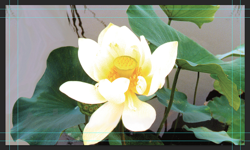
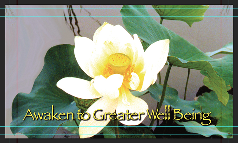
Above is your original FRONT of 3/11/15.
|
|
|
|
Above is your original BACK of 3/11/15.
|
|
In case you're curious, the INNERmost key line shows the type-safe area
(as the type should all be positioned within this line).
The OUTERmost key line shows the actual card TRIM.
The only change in production (this time vs. last) is that we'll use a MATTE finish on both sides this time. Let us know if you agree. And let us know whether we're in a real rush to print the new cards.
Best – R&D
|
|
|
|